5 Best Free Certificate of Appreciation Templates
A Certificate of Appreciation has to do something other certificate types don't: it needs to feel like it came from a person, not a process. The template carries that burden — the design signals whether the issuing organization actually means it, or just printed something. Beyond tone, the layout needs to accommodate a contribution description and a period of service without those fields feeling like afterthoughts squeezed into a footer.
What to Look For
- Room for a contribution description. Unlike completion or achievement certificates, this type needs a variable-length text block that names what the recipient actually did. Templates with a single short name field won't cut it.
- Issuer prominence. The credibility of a Certificate of Appreciation comes from who issued it, not what was certified. The issuing organization's name and signatory title need visual weight — not a small footnote at the bottom.
- A tone that matches gratitude, not bureaucracy. Overly rigid grid layouts, cold blues, and institutional seals can make an appreciation certificate read like a compliance document. The design should feel warm without being unprofessional.
- A signatory line with space for a title. Recipients who use this certificate in job applications or volunteer portfolios need a verifiable name and role attached — not just a signature scrawl.
- Print-readiness at A4 or letter size. Appreciation certificates are more likely to be framed or physically presented than most other types. High-resolution output and a clean bleed are worth checking before you commit to a template.
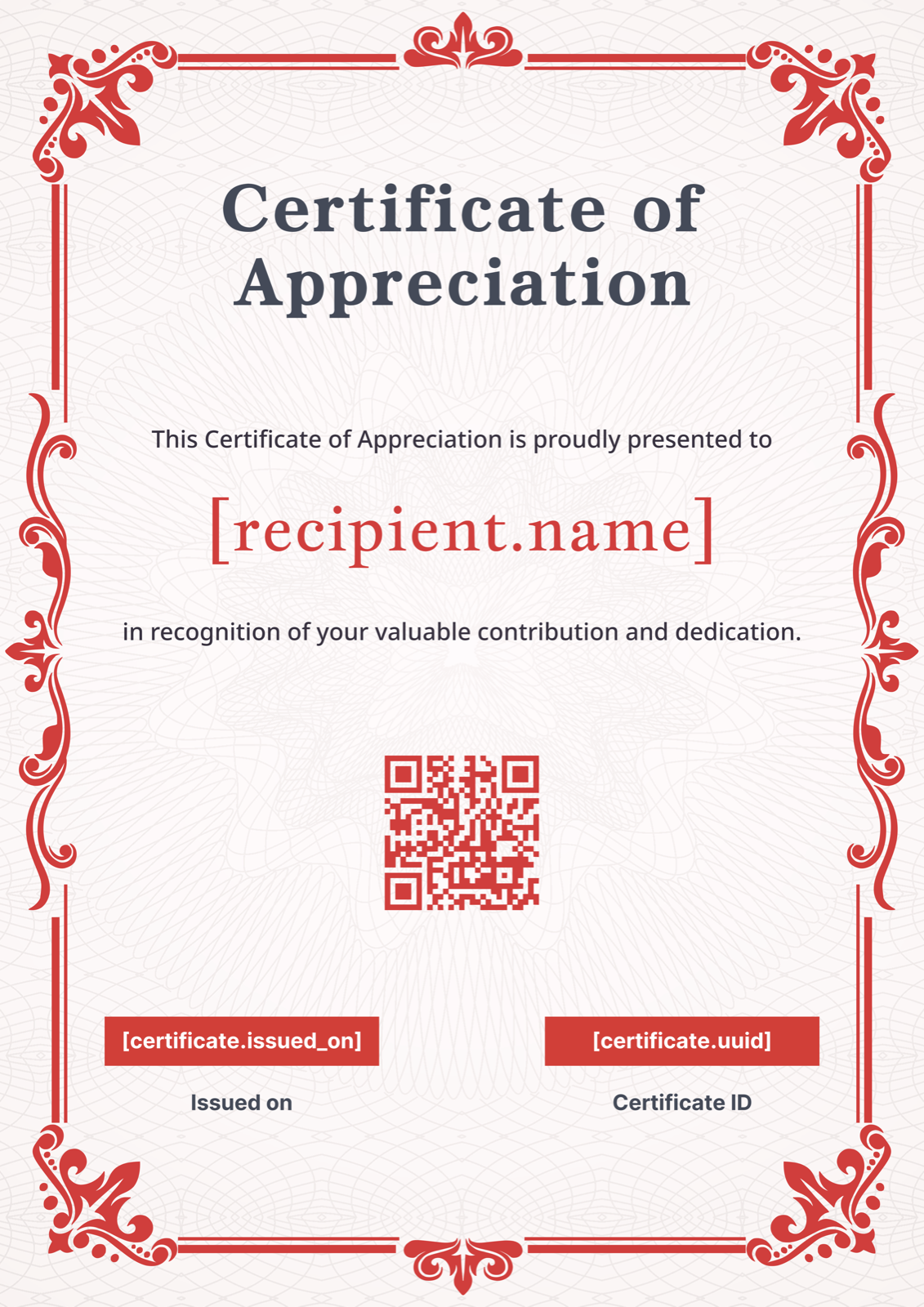
1. Red Ornate Appreciation Certificate
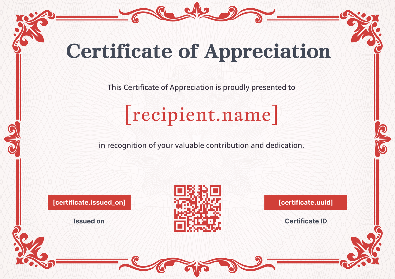
Ornate red corner flourishes frame a cream background in this landscape template, with classic serif typography that gives it the gravity of a document worth keeping. It's a strong fit for nonprofits and civic organizations that present certificates at formal events — the kind where the recipient walks to the front of the room. The built-in QR verification code field is a practical differentiator: if your volunteers or contributors will use this certificate in professional portfolios, a scannable authenticity link adds real credibility. Swap the corner color from red to your brand color to make it distinctly yours. Browse the full gallery.
2. Rose Heart Appreciation Certificate
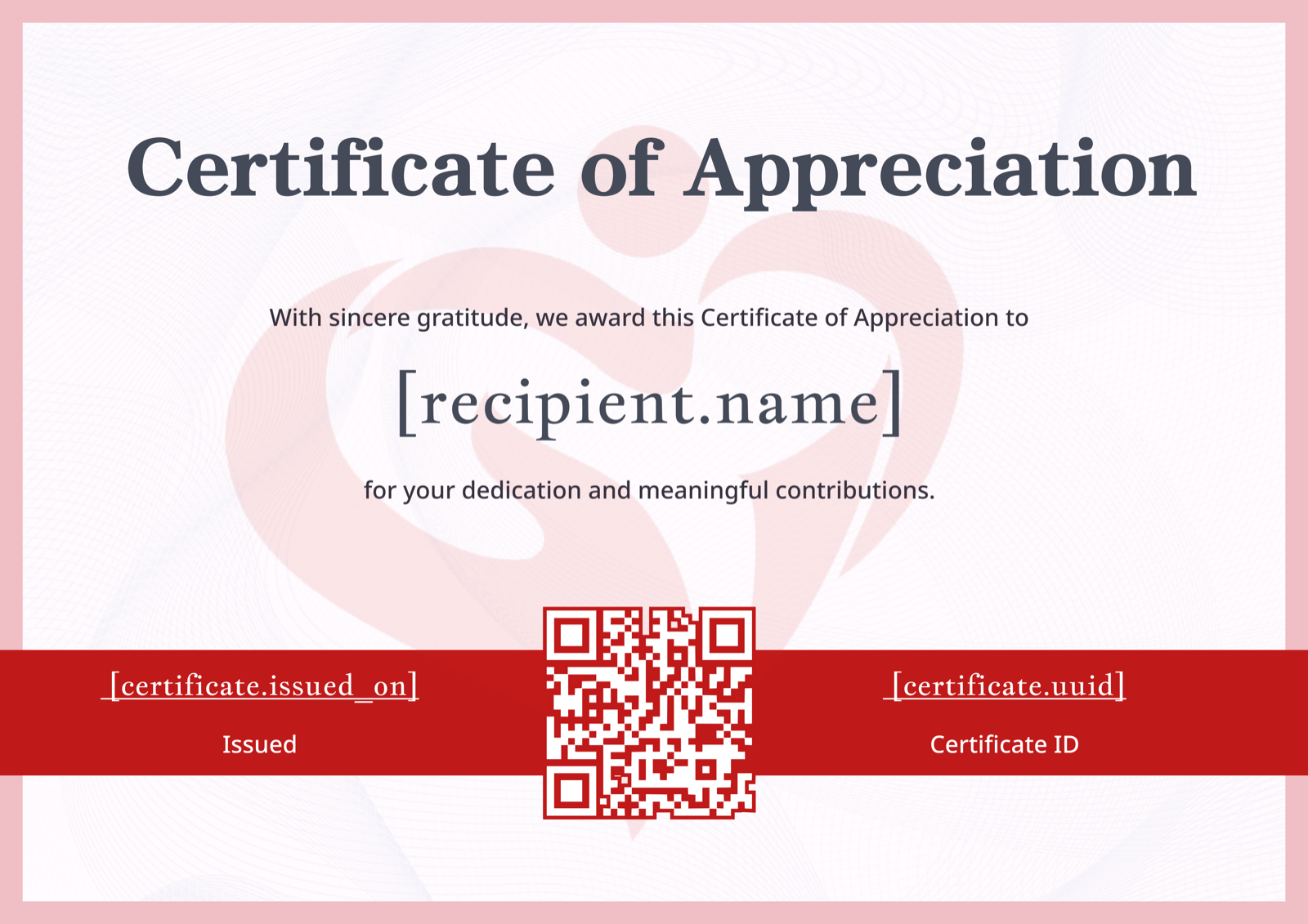
The soft rose background and subtle heart watermark make this the warmest-feeling template in the set, without tipping into greeting-card territory — the bold red footer bar keeps it grounded and structured. It works particularly well for school and parent volunteer programs, community groups, and anywhere the relationship between issuer and recipient is personal rather than purely organizational. If you're issuing certificates to a group of volunteers at the end of a long-running program, this layout reads as genuinely appreciative rather than procedurally issued. Consider replacing the footer bar color with your organization's primary color to anchor it to your brand. View it in the template gallery.
3. Minimalist Red Appreciation Certificate
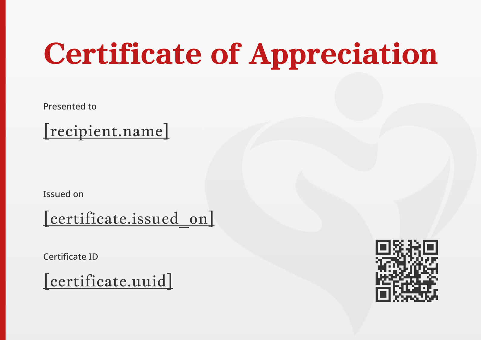
Where most appreciation templates lean into ornament to signal importance, this one strips back to a single bold red accent bar and a left-aligned layout that puts the text front and center. The result is a certificate that feels deliberate rather than decorative — well-suited for corporate CSR programs, tech companies, or any organization whose brand identity skews modern and uncluttered. The subtle heart watermark adds just enough warmth to distinguish it from a generic award certificate without compromising the clean aesthetic. The left-aligned structure gives the contribution description field unusually generous breathing room, which matters when the wording needs to be specific. See the full Certificate of Appreciation template gallery.
4. Gold Charcoal Portrait Appreciation Certificate
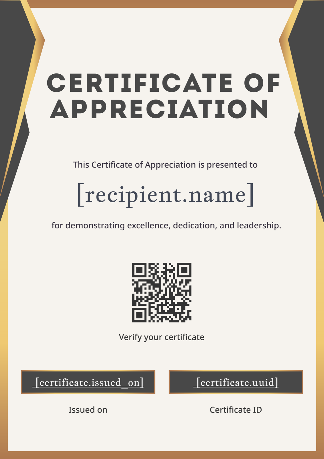
Gold and charcoal corner accents on a warm beige background give this portrait template a distinguished, almost archival quality — the kind of design that looks at home under glass in an office or reception area. The dark info bars create a clear visual structure for service dates and signatory details, which is useful when you need the certificate to function as a verifiable record of contribution rather than just a gesture of thanks. It's the right choice for long-service employee recognition, retiring board members, or major donors whose certificates may be displayed permanently. Replace the charcoal bars with your institution's color to give it a house-style feel without redesigning from scratch.
5. Red Classic Appreciation Certificate
Red ornate corner decorations and a classic border combine in this portrait template to produce something that reads as traditionally formal — the visual language of recognition that's been understood for decades. It suits educational institutions, civic awards, and any context where the audience expects a certificate to look like a certificate. The layout is straightforward enough that even a long contribution description won't crowd the design, and the portrait orientation makes it easy to slip into a standard document frame. If you're issuing to a mixed audience — some professional, some community — this is the safe choice that works across contexts without feeling generic.
Making It Your Own
Every template here is a starting point, not a finished product. Swap in your organization's logo, adjust the primary color to match your brand, and make sure the signatory line carries a real name and title — a signature alone won't satisfy someone using the certificate in a job application or volunteer portfolio. The step-by-step certificate creation guide covers the full customization process from template selection through to export and delivery.
The design gets you halfway there. The wording does the rest. A certificate that names exactly what the recipient did — and for how long — lands differently than one that thanks them for "valuable contributions." The Certificate of Appreciation wording guide has formal and casual examples across industries if you want to get the language right before you print. For the full range of designs, the Certificate of Appreciation template gallery has every style in one place — and if you're issuing to more than a handful of recipients, CertFusion can generate and deliver personalized certificates to your entire list automatically. You can also browse the free download and examples article for wording and template combinations matched to specific volunteer recognition scenarios.
Table of Contents
Related Articles
Discover more insights and stories that might interest you