5 Best Free Certificate of Authenticity Templates
A Certificate of Authenticity has different demands from any other certificate type. There's no recipient name to centre the design around — the item title, edition number, dimensions, serial reference, and authenticating authority all need space, and they need to read in a logical sequence a buyer or reseller can follow at a glance. The template you choose sets whether the document feels like a genuine provenance record or an afterthought printed on nice paper.
What to Look For
- Room for item-specific fields without crowding. A COA typically carries more text than a completion certificate — item title, medium, dimensions, edition notation, reference number, and a signature block all need to coexist without the layout collapsing.
- A visual authority signal. Because this certificate makes a legal-adjacent claim about an object's genuineness, design elements like seals, stamps, or substantial borders do functional work — they signal "verified document" in a way plain text doesn't.
- A dedicated verification area. A QR code placement or reference number field isn't decorative; it's the mechanism by which a future buyer confirms the certificate is real. Templates without space for this force you to improvise.
- Tone that matches the object's value. A certificate accompanying a RM 5,000 painting should not look like a course completion printout. Dark backgrounds, corner ornaments, and restrained typography all push the document toward "permanent record" rather than "participation ribbon."
- Portrait or landscape suited to how it will be stored. Certificates filed alongside purchase receipts and insurance documents often land in A4 folders — portrait templates tend to survive that journey better than landscape ones.
1. Maroon Quality Stamp Portrait Certificate of Authenticity
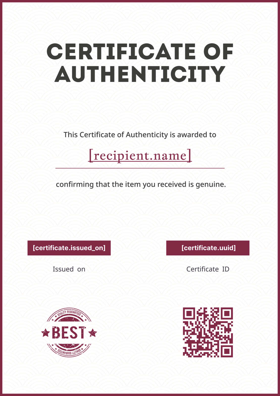
The dominant feature here is the quality guarantee stamp badge — a circular seal element that reads "verified" before a buyer has processed a single word of text. Maroon accents on a light background keep the layout from feeling heavy while still projecting authority, and the centred portrait orientation gives generous vertical space for item descriptions that run long. This works particularly well for product brands and artisan makers issuing certificates for handcrafted goods, where the stamp element echoes quality assurance conventions buyers already recognise. Swap the maroon for your brand colour and the stamp badge becomes a branded mark rather than a generic one. Browse the Certificate of Authenticity template gallery to compare it against the other options.
2. Minimalist Blue Accent Certificate of Authenticity
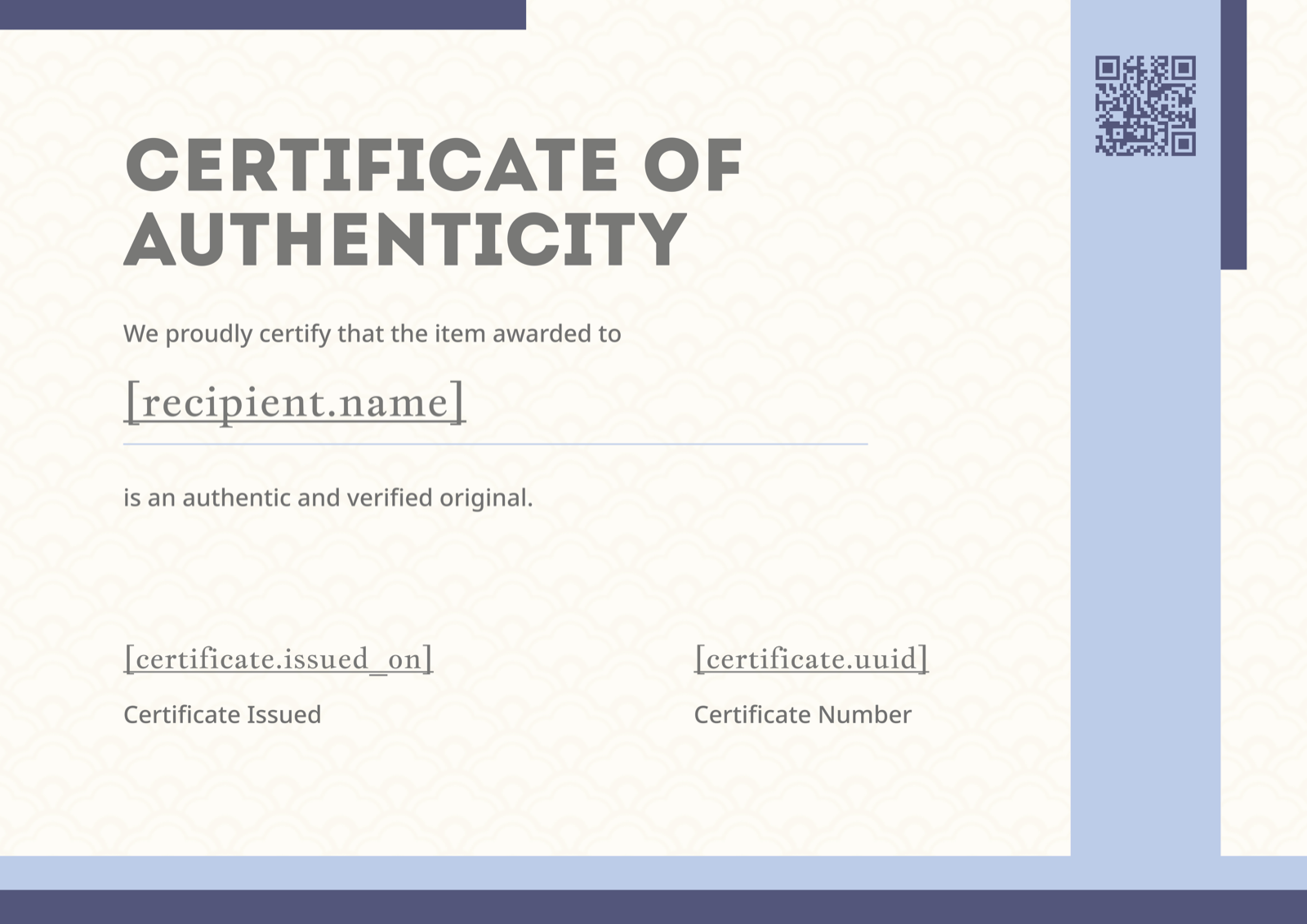
Thin blue vertical accents frame a landscape layout that keeps almost all the visual weight in the typography rather than the decoration. The left-aligned structure creates a clear reading hierarchy — issuer at the top, item details in the body, signature block at the foot — which makes it easy to populate with multiple item-specific fields without the design fighting back. Contemporary galleries issuing certificates for works that will be photographed and catalogued digitally will find this suits the aesthetic better than anything with an ornate border. The restrained palette also makes it straightforward to drop in a studio or gallery logo without a colour clash. Find it in the full Certificate of Authenticity template gallery.
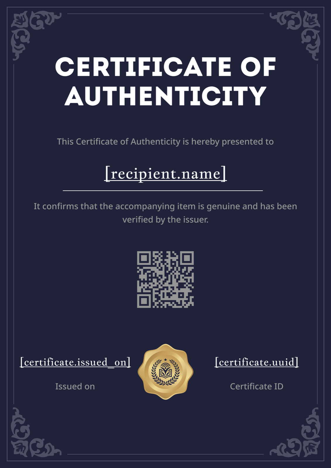
3. Classic Blue Border Portrait Certificate of Authenticity
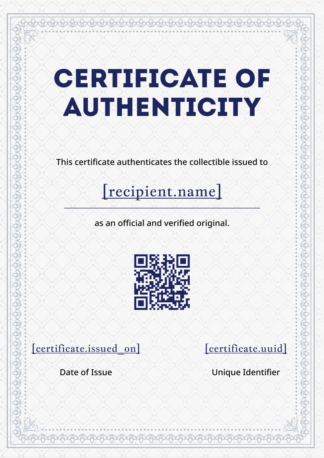
The ornate blue border announces immediately that this is a formal document — the kind of thing that gets framed or filed rather than folded into a pocket. What separates it functionally from purely decorative templates is the centred QR code placement built into the layout: buyers and future resellers can scan it to reach a verification page without contacting the issuer directly, which matters for collectibles and memorabilia that change hands multiple times over years. Navy blue typography on a light background keeps it legible at small print sizes, and the portrait format slides into standard document folders without trimming. Galleries handling secondary market sales or memorabilia dealers building long-term buyer trust will get the most from this one. If you want to understand what language works inside the bordered layout, the Certificate of Authenticity wording guide has formal examples that match this register.
4. Modern Navy Geometric Certificate of Authenticity
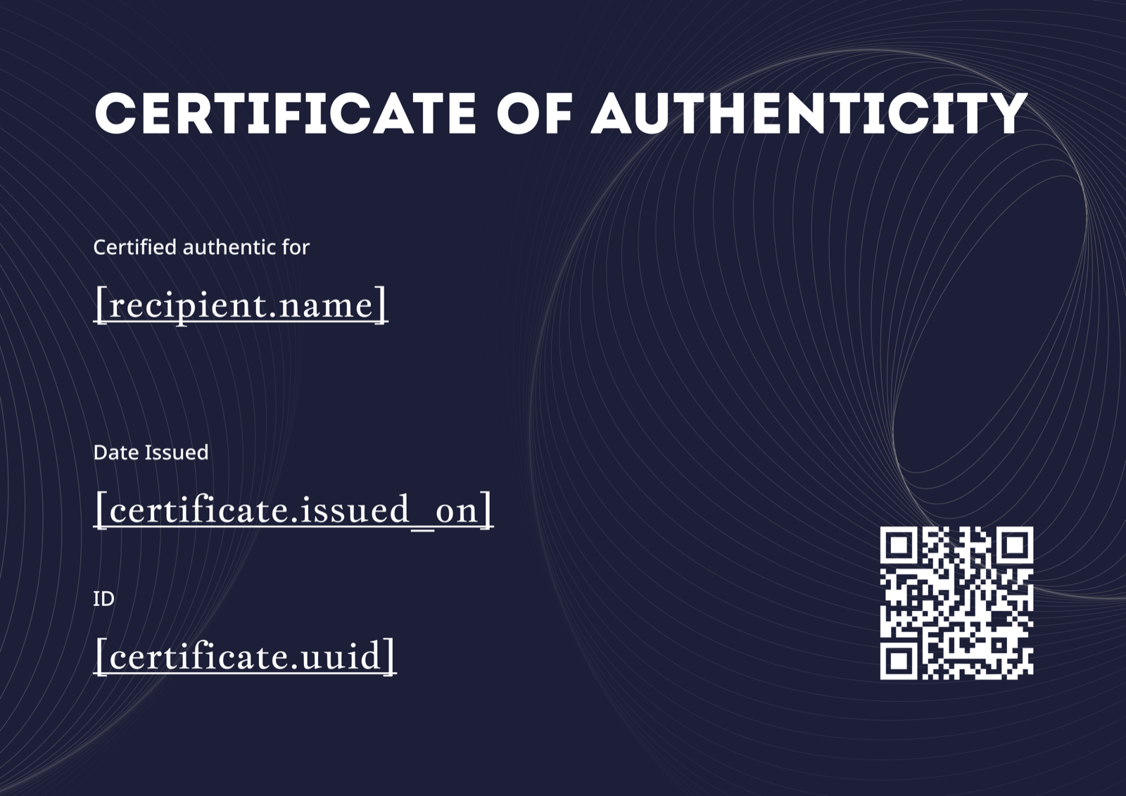
Dark navy fills the entire background, with geometric spiral line art providing texture without competing with the white typography. The landscape orientation and left-aligned layout give this a structured, almost technical feel — less "fine art provenance" and more "premium product documentation." That distinction makes it a strong match for limited-edition print studios, product drop certificates, or any context where the certificate is meant to feel like part of the product packaging rather than a separate administrative document. The geometric detailing is intricate enough to signal value but sparse enough that a product photo or brand mark inserted into the layout won't look out of place. See examples of wording that suits this register in the Certificate of Authenticity for art and collectibles article.
5. Navy Blue Portrait Certificate of Authenticity
Corner ornaments, a gold verification seal, and a full dark navy background put this at the formal end of the spectrum — the kind of certificate that auction houses and estate appraisers expect to see accompanying high-value works. The gold seal does specific work here: it echoes the wax seal conventions of traditional provenance documentation, signalling permanence and authority to buyers who take authentication seriously. Portrait orientation keeps it filing-cabinet friendly, and the classic serif typography reads as timeless rather than dated. Artists selling original works at the upper end of the market, or studios issuing certificates for archive-quality limited editions, will find this template carries the appropriate weight without requiring any additional design effort.
Making It Your Own
Swap in your studio or gallery logo, adjust the accent colour to match your brand, and replace the placeholder item fields with the specific details your objects require — title, medium, dimensions, edition number, serial reference. The step-by-step certificate creation guide walks through the full customisation process in each supported format. Design gets you so far, but the wording is what gives the certificate its legal and commercial weight — the Certificate of Authenticity wording guide covers how to phrase item descriptions, edition notations, and authenticating statements precisely.
The full Certificate of Authenticity template gallery has the complete range if none of these five is quite right. For studios and galleries issuing certificates at volume — an edition of 100, a gallery show with 30 works, a product release — CertFusion generates each certificate individually from a spreadsheet of item data, so every edition number, serial reference, and item title populates correctly without doing it by hand.
Table of Contents
Related Articles
Discover more insights and stories that might interest you