Best Design Practices for Certificate Backgrounds
Introduction to Certificate Design and Its Importance
Certificates are a powerful way to recognize achievements, whether in academics, professional training, events, or other accomplishments. A well-designed certificate is more than just a piece of paper; it’s a testament to the recipient’s effort and success. One of the most critical aspects of certificate design is the background, as it sets the tone, enhances visual appeal, and supports readability.
Creating a professional and visually appealing certificate background can be a challenge, especially for those without design experience. That’s where tools like CertFusion, an online certificate maker, come in handy. CertFusion offers customizable templates, user-friendly tools, and a range of design options to make certificate creation easy and enjoyable. In this guide, we’ll walk you through essential design practices to create beautiful, effective certificate backgrounds that make a lasting impression.
Key Elements of a High-Quality Certificate Background
Designing a certificate background involves several components that work together to create a cohesive look. Here are the elements that should be carefully considered.
a. Color Schemes and Themes
The color scheme is one of the first things people notice on a certificate. The choice of colors can convey professionalism, energy, prestige, or even casual fun. For professional or academic certificates, muted and classic colors like navy, black, and gold work well, while lighter colors and pastels may be more suitable for informal or celebratory certificates.
With CertFusion, choosing the right colors is simple. The platform includes a color picker and a variety of pre-designed themes that cater to different events, from formal achievements to casual event participation. CertFusion’s options allow you to experiment with color combinations and pick a palette that aligns with your event or organization’s branding.
b. Patterns and Textures
Patterns and textures can elevate a certificate background by adding depth and personality. However, it’s essential to keep these elements subtle to avoid distracting from the text. Popular choices include light geometric patterns, watermarks, or simple line textures.
CertFusion offers a library of customizable textures and patterns, allowing you to try different backgrounds that maintain a professional look while adding visual interest. By using these features, you can achieve a unique style without overpowering the content of the certificate.
c. Borders and Frames
Borders and frames provide structure, drawing the viewer's eye inward and giving the certificate a refined, finished look. Thin, elegant borders are ideal for academic and professional certificates, while thicker frames can be used for event or participation certificates to add a touch of boldness.
CertFusion’s design tool provides a variety of adjustable borders that can be tailored to your certificate type, from classic lines to decorative frames. Adjusting border thickness and color to match the theme ensures that the border complements rather than competes with other design elements.
d. Contrast and Readability
A certificate’s readability is crucial to its effectiveness, as recipients want to display and showcase their achievements. Ensuring sufficient contrast between the background and text is a key design practice, as low contrast can make the text difficult to read.
CertFusion’s tools allow you to preview text readability as you adjust background colors and patterns. This feature ensures that the final design provides excellent contrast, enabling recipients and viewers to read the certificate clearly and easily.
Popular Styles and Trends in Certificate Backgrounds
Staying updated on design trends helps keep certificates visually appealing and relevant. Here are some of the most popular styles in certificate backgrounds.
a. Minimalistic Designs
Minimalism is increasingly popular in certificate design, with clean lines, simple colors, and plenty of white space. A minimalist approach enhances readability and projects a sophisticated, modern look. This style is particularly suitable for corporate and academic certificates, where the focus should be on the recipient's achievement rather than elaborate graphics.
CertFusion includes several minimalist templates with clean layouts, limited color palettes, and simple typography, making it easy to create certificates that look polished and professional without extra design elements.
b. Vintage and Classic Backgrounds
For a timeless look, vintage and classic backgrounds are a go-to choice. This style often includes decorative borders, elegant fonts, and muted color schemes, evoking a sense of prestige and tradition. It’s a popular option for academic diplomas and achievement awards that aim to convey honor and accomplishment.
CertFusion offers a variety of vintage-inspired templates that capture this classic aesthetic. With the ability to add ornate borders and adjust colors to suit your needs, CertFusion makes it simple to create a design that feels both distinguished and elegant.
c. Custom and Brand-Specific Backgrounds
More organizations are creating certificates with branded backgrounds to reinforce their brand identity. This approach involves using brand colors, logos, and design elements that are unique to the organization. Branded certificates provide recipients with a sense of exclusivity and allow companies to enhance brand visibility.
CertFusion’s customization options allow users to upload logos, customize color schemes, and apply brand-specific design elements. This makes it easy to produce certificates that reflect your organization’s identity and values.
Designing Backgrounds for Different Types of Certificates
Each type of certificate has its unique design requirements. Here’s a breakdown of design practices based on common certificate types.
a. Academic and Achievement Certificates
Academic and achievement certificates typically emphasize formality and prestige. For these types, consider using classic colors (like black, gold, or blue) and simple patterns or textures. Borders can be added to frame the content, creating a distinguished look that highlights the importance of the achievement.
CertFusion includes a range of templates tailored for academic settings, making it simple to create certificates that reflect the solemnity and respect associated with academic achievements.
b. Corporate Training and Professional Development Certificates
Corporate training and professional development certificates should look polished and professional. Neutral colors, like navy, gray, or silver, work well here. A minimalist design, with a clean background and maybe a subtle pattern, helps maintain the focus on the certificate’s content.
CertFusion’s corporate-friendly templates are designed to look modern and professional, aligning with the aesthetic that’s often required in the business world.
c. Event and Workshop Participation Certificates
For events, workshops, or other informal achievements, certificate designs can be more colorful and expressive. Patterns, borders, and vibrant colors can be used to reflect the event’s tone. For example, an outdoor workshop certificate might use earthy colors and nature-inspired textures.
Finding high-quality certificate backgrounds can be challenging, but CertFusion offers a comprehensive collection of free certificate background images to make your design process effortless.
Using CertFusion to Apply Best Design Practices
Now that we’ve covered the best practices, let’s look at how to apply them using CertFusion. CertFusion offers a suite of design tools and templates that make it easy to create professional certificates, even if you’re new to design.
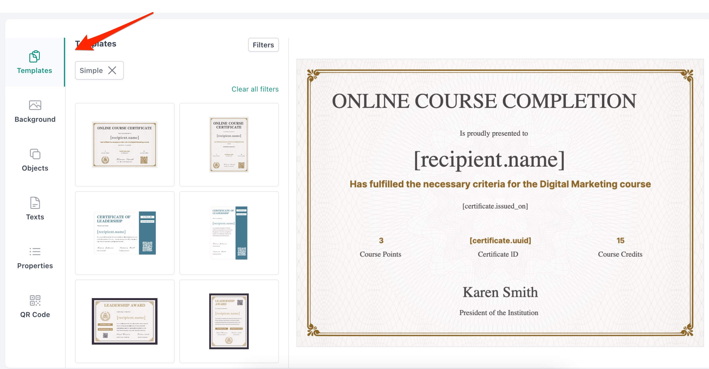
- Start with a Template – Choose from CertFusion’s library of pre-designed templates, which cover various themes and certificate types. This step gives you a solid foundation and lets you focus on personalizing the details.

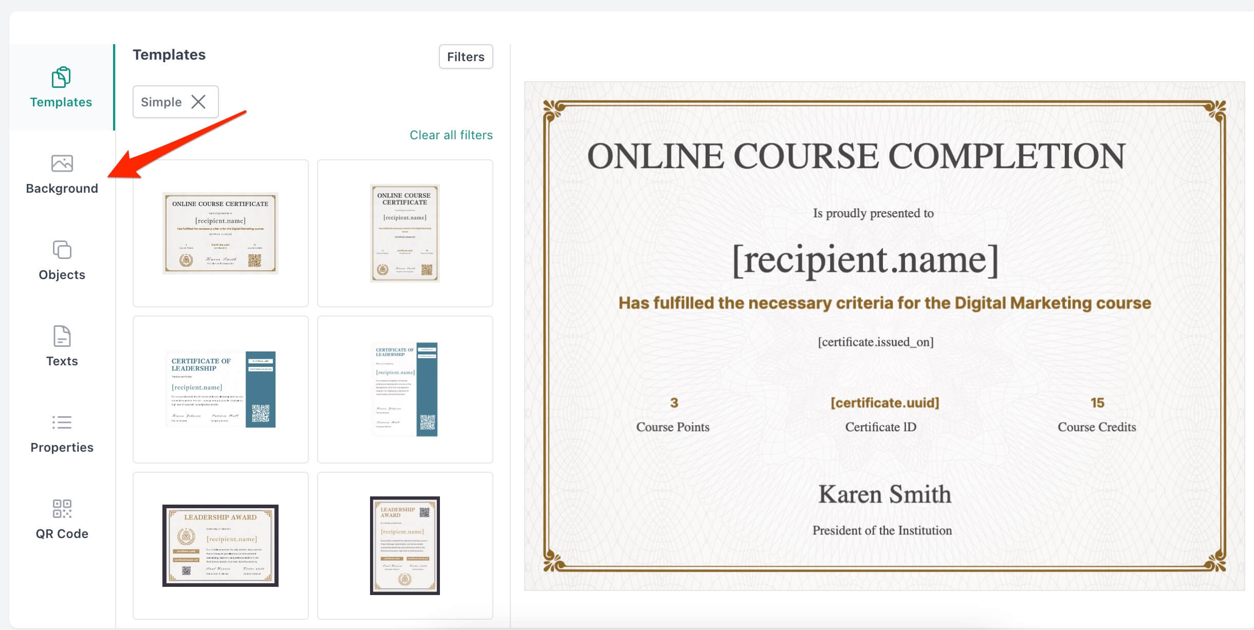
- Customize the Background – CertFusion allows you to select colors, patterns, and textures for the background. The drag-and-drop interface lets you preview the design as you work, making adjustments easy and quick.

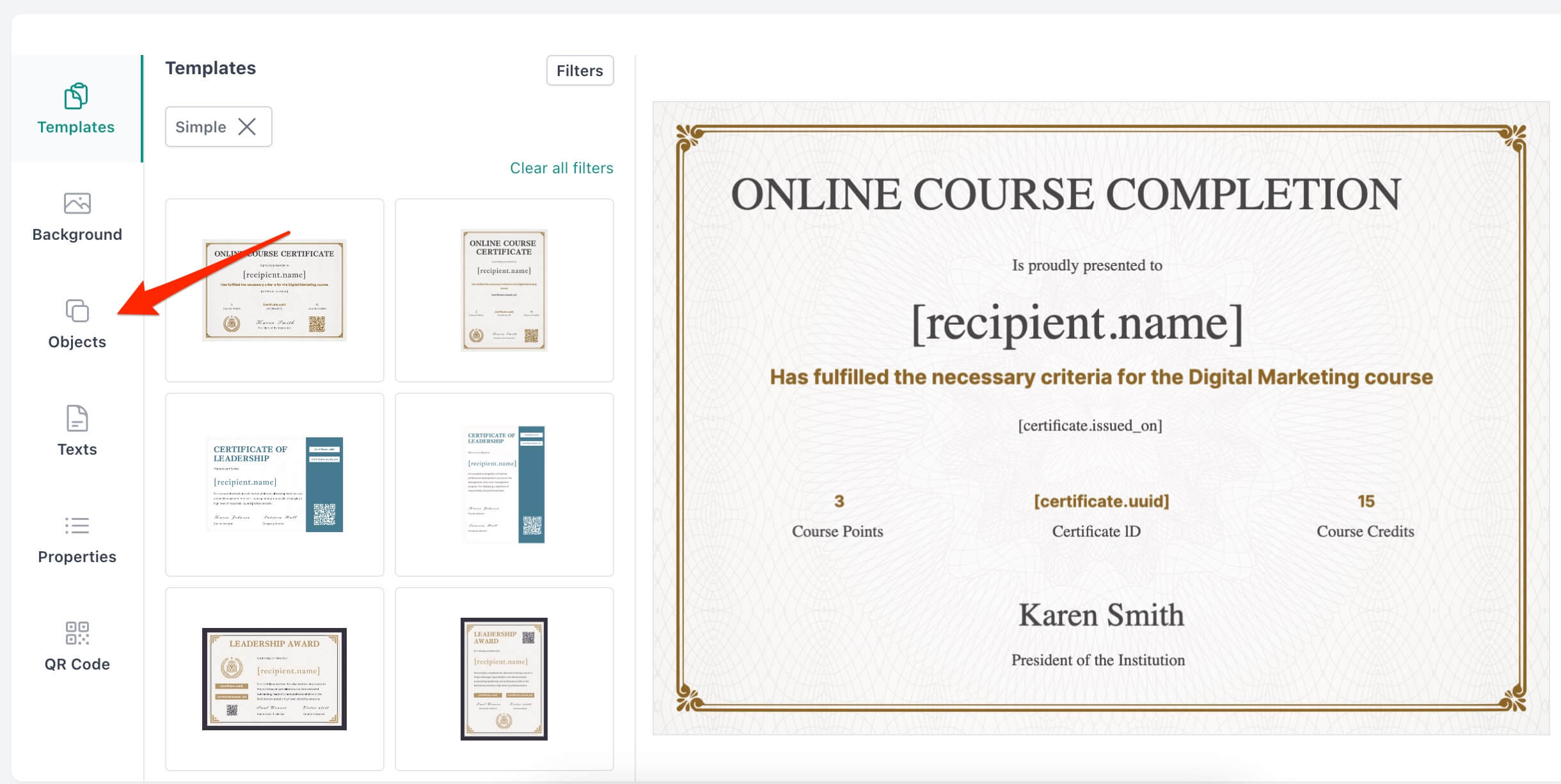
- Add Logos – You can upload logos and brand elements, adding a touch of customization and branding to your design.

Common Mistakes to Avoid in Certificate Background Design
Designing certificate backgrounds requires a balanced approach. Here are some common mistakes to avoid:
a. Overloading with Patterns or Colors
While patterns and colors can enhance a design, using too many can make the certificate look cluttered and unprofessional. Stick to one or two patterns and a cohesive color scheme to maintain simplicity.
b. Using Low-Resolution Images
Certificates are often displayed or framed, so it’s important to use high-resolution images to avoid pixelation. CertFusion supports high-res downloads, ensuring that your final certificate looks sharp and professional.
c. Ignoring Readability
A certificate’s message should be easy to read. Avoid light text on a light background and overly decorative fonts. CertFusion provides contrast tools to help you achieve a design that’s easy on the eyes.
Conclusion: Creating Memorable Certificates with CertFusion
Creating a beautiful certificate background doesn’t have to be complicated. By following these best practices, you can design backgrounds that are visually appealing, professional, and appropriate for any occasion. CertFusion makes the process even easier, offering a variety of templates, design tools, and customization options that allow anyone to create high-quality certificates in minutes.
Whether you’re designing for academic achievements, corporate training, or events, CertFusion has everything you need to produce certificates that recipients will be proud to display. Explore CertFusion’s features today and start designing certificates that leave a lasting impression!
Table of Contents
Related Articles
Discover more insights and stories that might interest you
