Printable Attendance Certificates: Tips & Best Practices
Creating a printable attendance certificate requires more than just a digital design. You want your certificates to look professional on paper, be durable, and convey a sense of accomplishment to recipients. Whether for schools, workshops, seminars, or webinars, following these tips will help you produce certificates that leave a lasting impression.
1. Choose the Right Paper
The type of paper can make a huge difference in the final look and feel of your certificates.
- Weight & Thickness: Use 80–120 lb cardstock for a sturdy feel.
- Finish: Matte finishes are professional, while glossy finishes make colors pop.
- Color: Stick to light backgrounds (white or cream) for clarity and print accuracy.

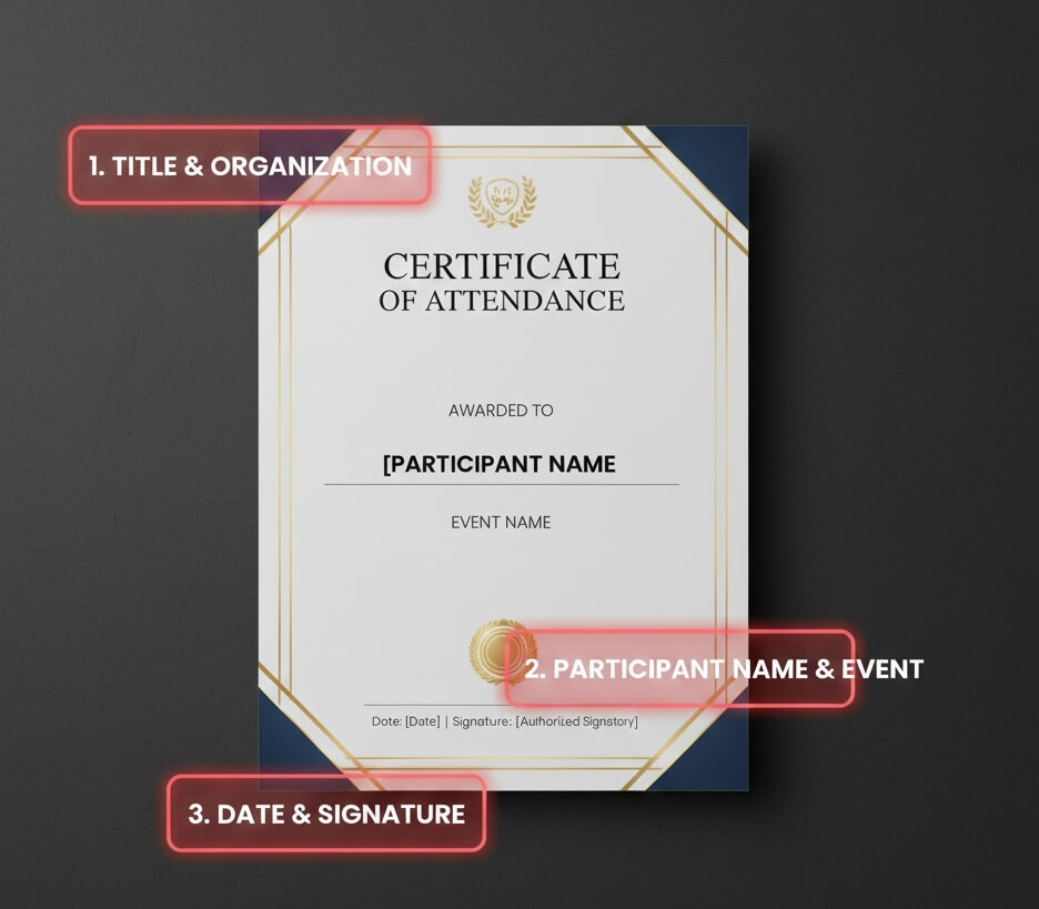
2. Select a Professional Layout
A well-structured layout enhances readability and aesthetic appeal.
- Margins: Keep consistent margins to prevent content from being cut off.
- Alignment: Center titles and participant names for a balanced look.
- Hierarchy: Highlight key information like participant name, event name, and date.
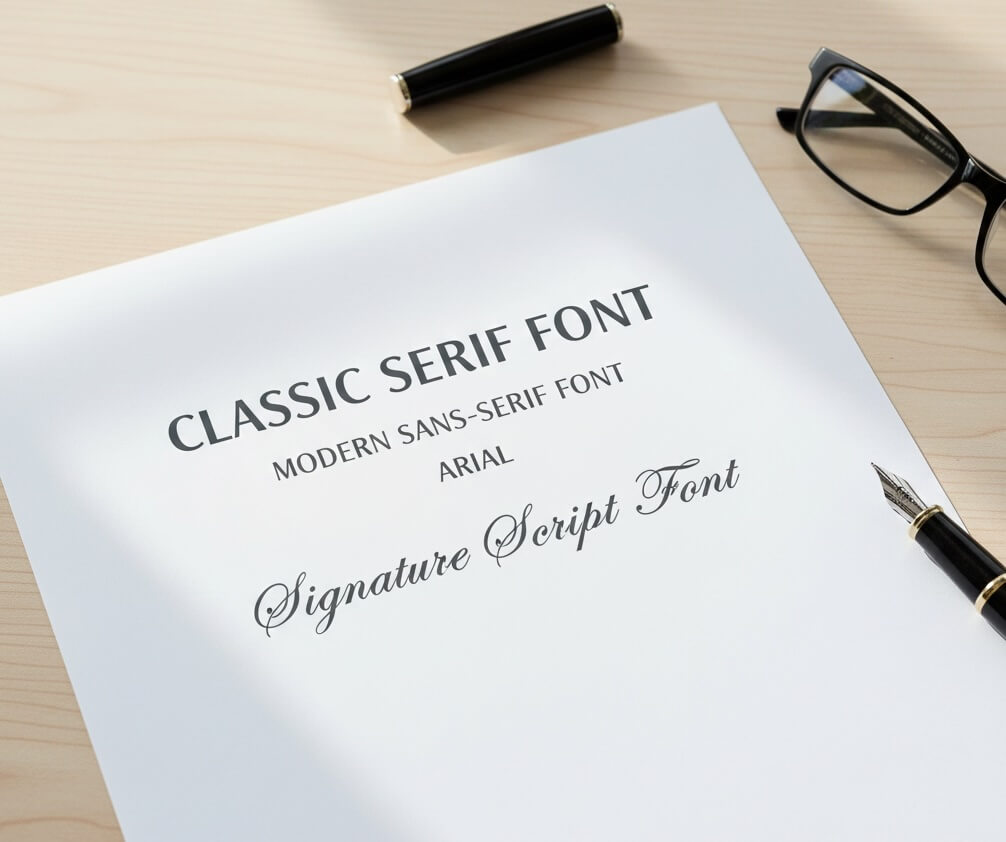
3. Pick Fonts Carefully
Fonts communicate style and professionalism.
- Serif fonts (e.g., Times New Roman) give a classic feel.
- Sans-serif fonts (e.g., Arial) look modern and clean.
- Calligraphy or script fonts work well for names or signatures but should remain readable.
4. Use High-Resolution Graphics
Low-quality logos or images will look blurry when printed.
- Ensure logos and decorative elements are 300 DPI or higher.
- Vector graphics are ideal for borders, badges, or icons.
- Avoid overly complex backgrounds that distract from text.

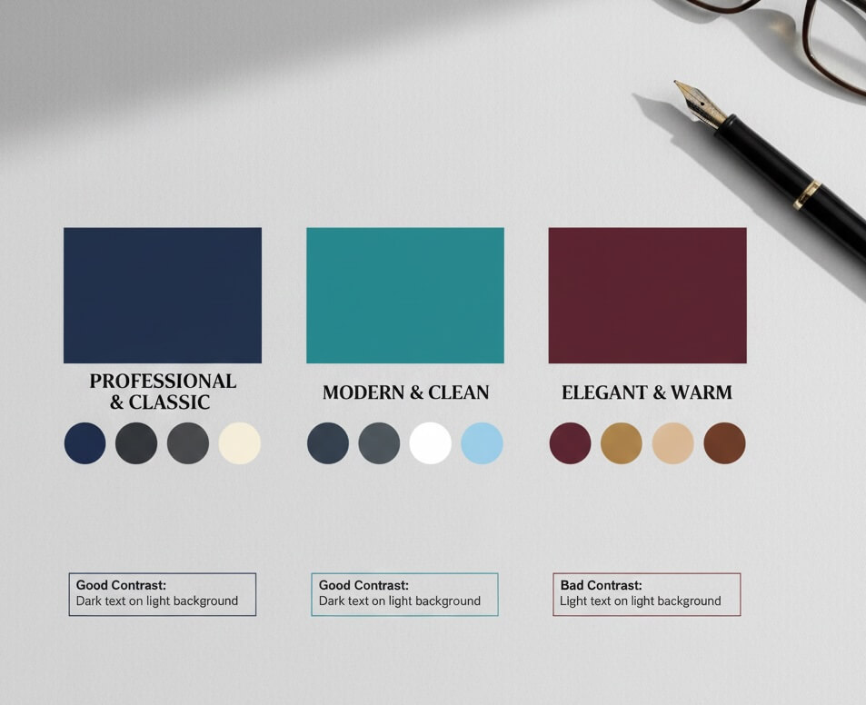
5. Consider Color and Contrast
Proper color choices ensure readability and professional appeal.
- Use dark text on light backgrounds for maximum legibility.
- Stick to 2–3 main colors to avoid a cluttered appearance.
- Match colors to your organization’s branding.
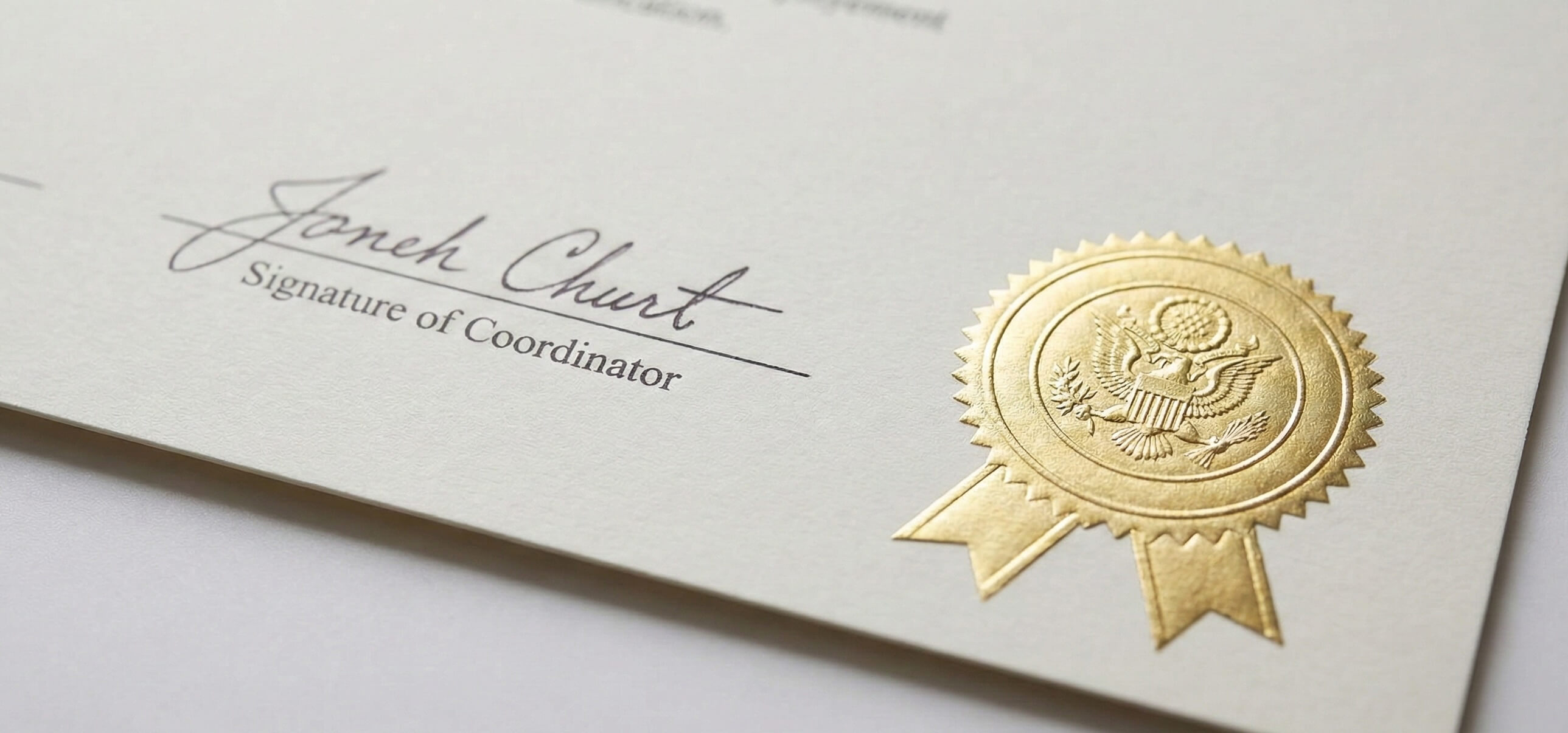
6. Incorporate Signatures and Seals
Adding a signature or official seal increases authenticity and credibility.
- Include space for manual or digital signatures.
- Embossed seals or gold foil stickers add a premium touch.
- Ensure they don’t overpower the main content.
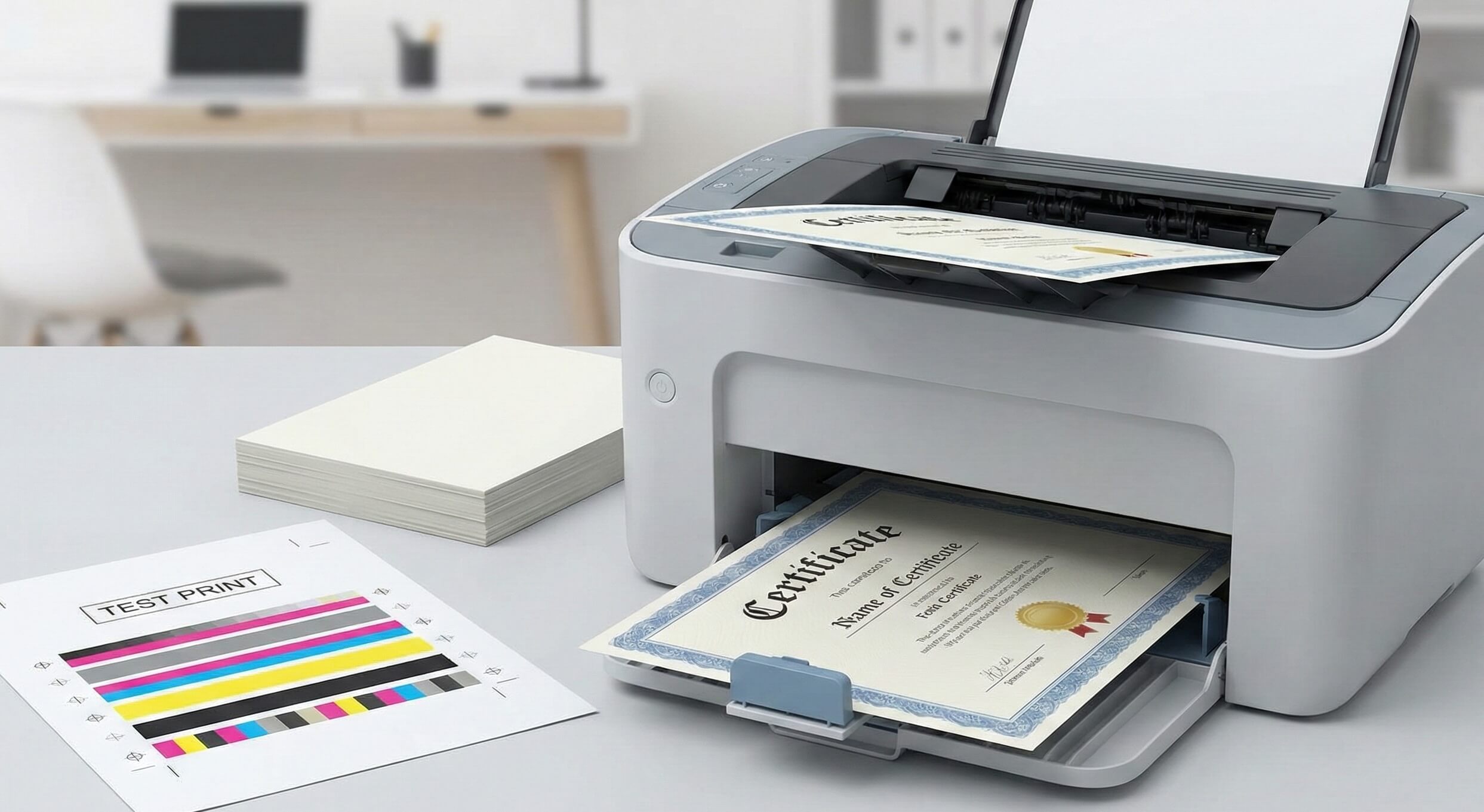
7. Optimize for Printing
Before printing in bulk, run test prints to check:
- Margins and bleed – Prevent text from being cut off.
- Color accuracy – Ensure printed colors match digital design.
- Paper feeding – Make sure your printer handles the chosen cardstock.
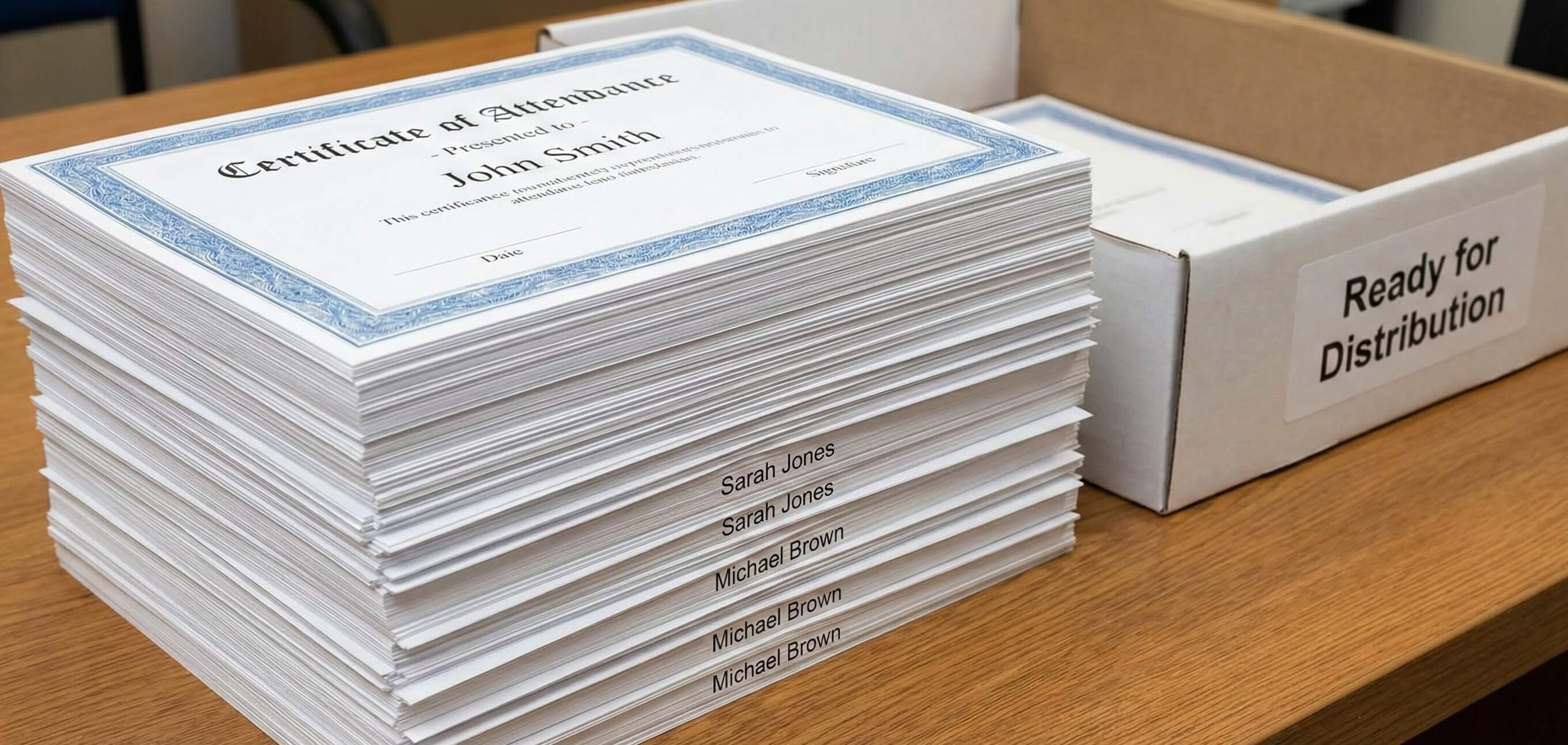
8. Automate for Bulk Certificates
If distributing to many participants, consider automation:
- Use certificate generators to populate names and event details automatically.
- Export as print-ready PDFs for professional printing.
- Label files clearly for easy sorting and distribution.
Free Templates & Design Inspiration
Need a head start? Explore our Attendance Certificate (Free Templates) page to find editable templates, ready-to-print designs, and ideas suitable for schools, conferences, workshops, and webinars.
Final Thoughts
A printable attendance certificate is more than a formality—it reflects your organization’s professionalism and appreciation for participants. By following these best practices in paper selection, layout, fonts, graphics, and printing, you can create certificates that are polished, professional, and memorable.
Table of Contents
Related Articles
Discover more insights and stories that might interest you